Reimagining a global meal kit company’s mobile experience from the ground up
Organization
Marley Spoon
Role
UX Lead
Date
2019 – 2020
Marley Spoon helps people around the world to save time while cooking healthy, home-cooked meals. Each week, Marley Spoons helps customers in three continents and eight countries to choose meals they’d like to cook from a changing weekly menu and receive all of the ingredients and recipes they need directly to their door.
Marley Spoon is a multinational meal kit company that helps people save time while eating healthy, home-cooked meals. Each week, people choose meals they’d like to cook from a changing weekly menu and receive all of the ingredients and recipes they need directly to their door. Since launch, Marley Spoon has delivered 27 million meals to home cooks in three continents and eight countries around the world.
Marley Spoon’s portfolio included its flagship “Marley Spoon” brand; a brand extension in partnership with Martha Stewart; and a lower-priced brand alternative called “Dinnerly.” In practice, the company used a white label strategy for its digital assets.
When Marley Spoon launched, the business model focused on customers purchasing individual boxes on a one-off basis. It wasn’t until later in their growth that they switched to a subscription model, and expanded from offering six to twenty unique recipes in each weekly menu for each brand.
Marley Spoon’s mobile app was created when the web platform was the company’s primary digital product. The app was designed to support one-off box purchases, and wasn’t intended to deliver an experience beyond facilitating these purchases. IN 2019, the mobile app hit an inflection point of design and development debt. I was asked to own a project effort to reimagine and execute on an intentional, comprehensive mobile product experience.
I led a seven-person project team through research and discovery, strategy, and iterative design, resulting in a new white-label mobile experience that served each of Marley Spoon’s brands across a global market.
As UX Lead, I defined and carried out a complete reimagination of the Marley Spoon mobile experience: the affectionately named Project Dollop. Over the course of six months, I lead a seven-person project team through research and discovery, strategy, and iterative design. The result: a new white-label mobile experience foundation that serves three different brands across a global market.
As the lead on this ambitious project effort, I needed to plan a working model that would give us clear structure and guide feasibility and viability from the beginning. We needed to be decisive as a team, avoid scope creep, and drive creativity through constraints.
I sketched out a multi-month cross-collaborative roadmap that would lead us through clear discovery and delivery phases, weighted towards larger discovery cycles at the beginning before shifting into faster, iterative delivery cycles once we had a clear design vision and direction.
Discovery
To kick off the project and align the cross-disciplinary team from the beginning, I designed and held two workshops: a product vision workshop, and a principles workshop.
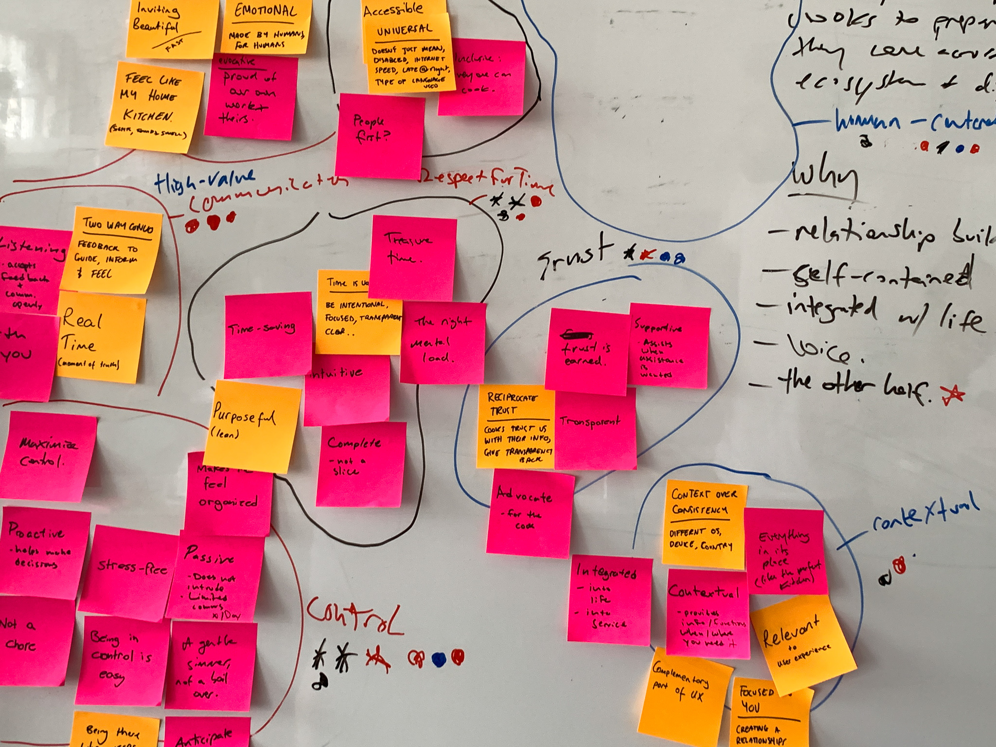
The outcomes of these workshops gave us a shared context to connect us as a team as we moved forward.
Read more: Stop relying on gut decisions and define your principles
I then led the team in planning research that would help us better understand the experience as it exists today, and where we’d find the biggest opportunities to transform the experience. As a digital product that intersects with a physical product experience, we had the unique challenge of directly affecting our customer’s kitchen and cooking experience.
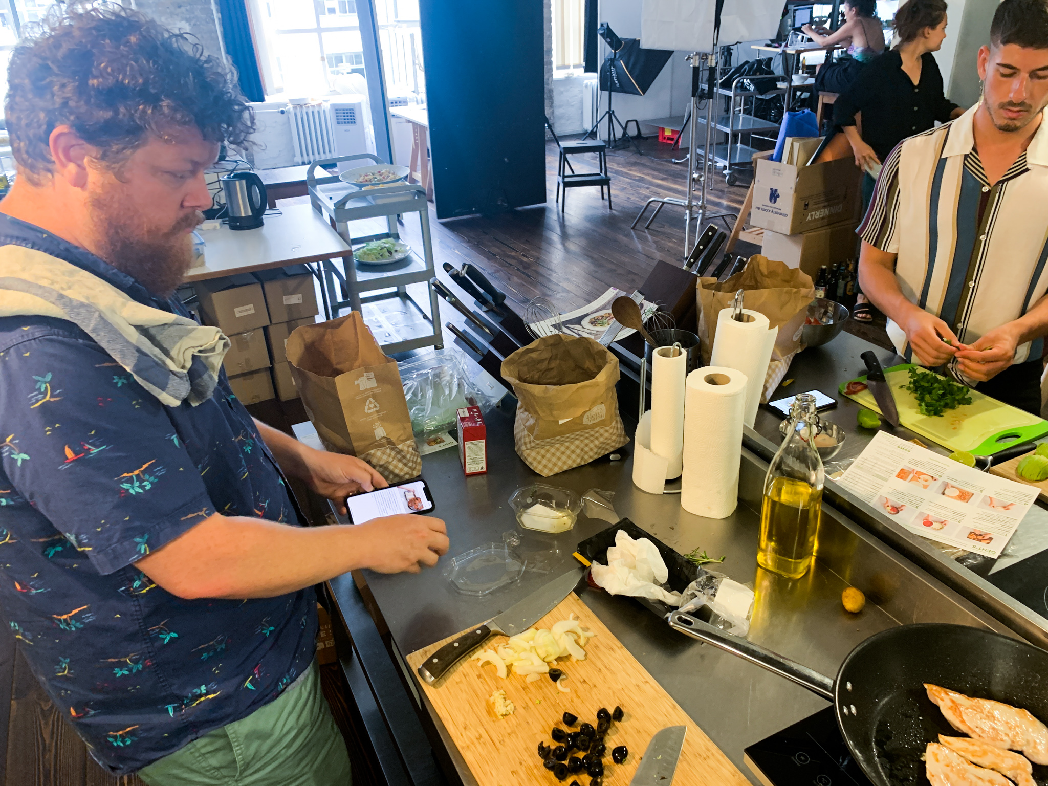
To bring greater transparency and openness around the project to the whole company, we set up a “war room” for our research activities next to the culinary test kitchen. Anyone walking by could stop and see what we were doing and directly contribute to our work.
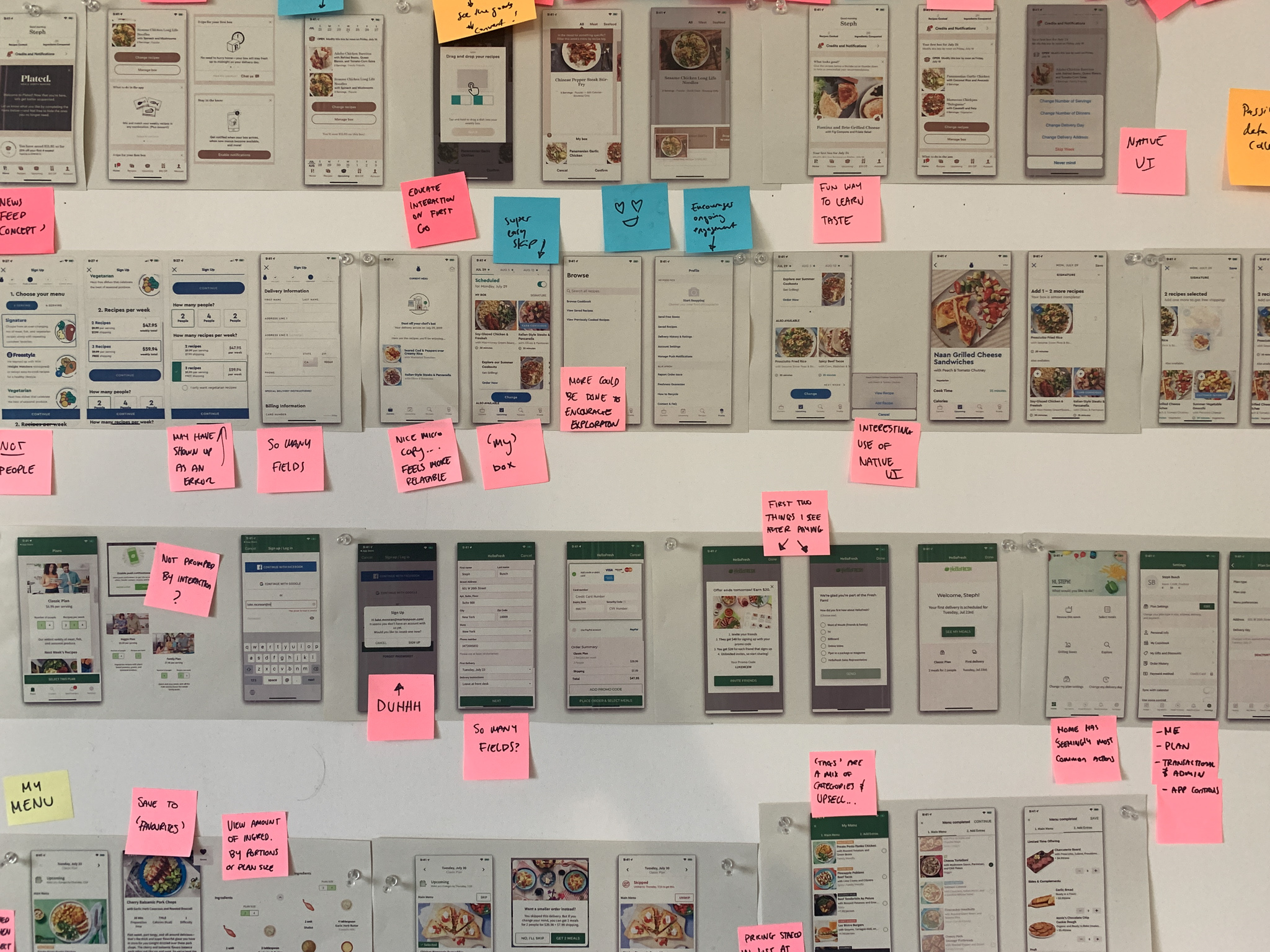
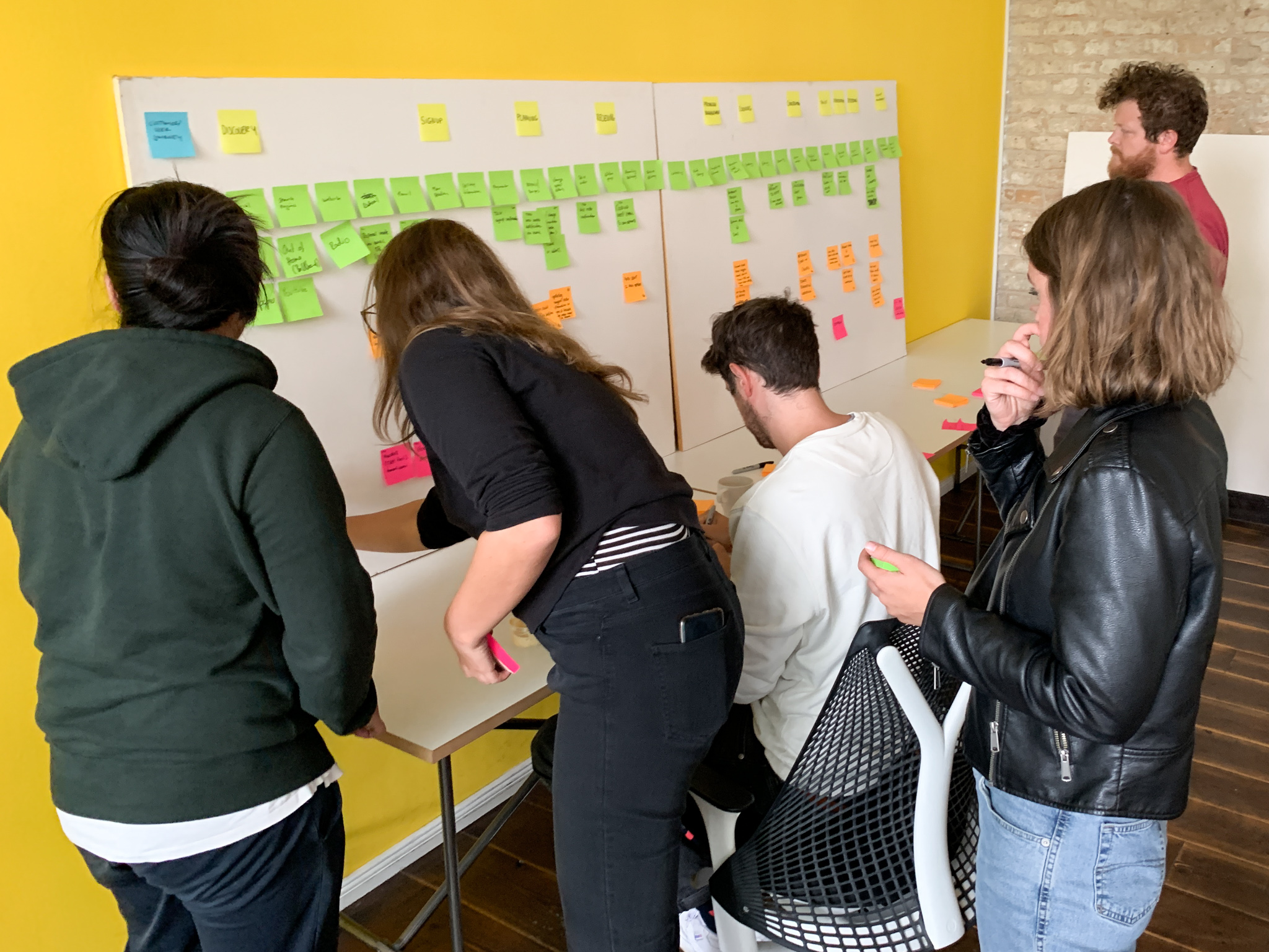
We conducted journey mapping workshops with several cross-disciplinary teams to get a better sense of the complete customer journey and identify potential key moments to explore further. We did a competitive analysis as a team, signing up for competing services, ordering mealkits, and cooking meals as a group. To build stronger cross-country collaboration in the early stages of the project, we asked the marketing and culinary teams in the USA and Australia to do the same. A deep dive into customer support contacts and workshops with the customer care team revealed several common themes around the current experience.
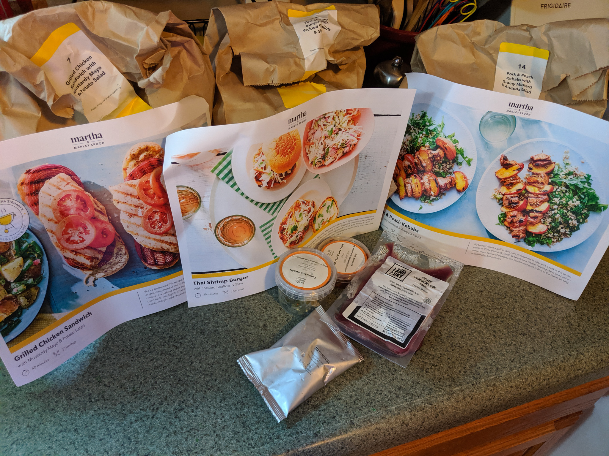
We also wanted a deeper understanding of our customer’s kitchen environment and routines. How does the process of planning, receiving, and cooking our meals unfold? Who’s involved? What kind of physical environment are they working within?
To build this understanding, we conducted a diary study where we asked more than 30 customers in the USA, Germany, the Netherlands, and Australia to document their experience receiving and cooking their mealkits using photos, videos, and notes. After our participants shared their outcomes, we held followup interviews to dig deeper into their stories.
I guided synthesis sessions after each research activity, and we created a master insights document. This was a living document that we added to and changed over time to reflect what we learned.
Making it actionable
Based on our learnings, I worked with the project team to identify the key areas of the user journey and create specific design challenges for each area. Then, we could structure our work into a series of 2-4 week cycles of design exploration, prototyping, testing, and iteration focused on each key area.
We identified four key areas of the mobile experience: planning, receiving, cooking, and management.
One of the key technical challenges I identified while defining the product strategy was in scaling our white label approach across brands and apps.
We knew that our work needed to support all of Marley Spoon’s brands effortlessly. That posed a compelling challenge in design. If we designed only for one brand, then we risked making design decisions that wouldn’t be effective in the context of other brands. But if we tried to design for each of these brands at once, then we’d be creating a massive amount of additional design work that wouldn’t actually be moving us forward.
In response, I proposed that we use a “white label” approach from the very start. Instead of designing “the Marley Spoon app,” we would design the “Dollop app”—a brand-independent, system-oriented foundation that delivers the best possible baseline user experience. Then, much like theming an IDE, each unique brand identity and personality would build on top of a solid, validated foundation.
This approach fed into the Pistachio Design System, a white-label, extensible, atomic design system for all of Marley Spoon’s mobile apps.
Digging our teeth into design
At the beginning of each cycle, we re-aligned on our focus and design challenges. Then, we moved through rapid cycles of ideation and prototyping. I planned and scheduled remote user testing sessions each Friday, which let us test and iterate on our ideas quickly.
Within each cycle, we converged on the most promising directions and underlying interaction patterns. Throughout this early stage, we kept to low- and medium-fidelity design outcomes.
Improving prototyping
We built our first few prototypes using Figma. However, we quickly discovered that one particular workflow (choosing and swapping recipes for a box from a weekly menu of recipes) was challenging to test without an incredibly complex and fragile prototype.
Another designer on the project team proposed we explore using Protopie for the prototype. This change in tooling was transformational for the design team because it let us explore several ideas in much more “real world” fidelity, and ultimately enabled us to test our ideas in kitchen environments.
Throughout the project, we did design exploration and rapid prototyping in Figma. Then, we would bring our concepts into a single, versioned Protopie prototype for testing with users. This resulted in a prototype that delivered most of the functionality of the complete app, with realistic UI animations, transitions, and statefulness. This prototype served as a living reference for the development team in delivery.
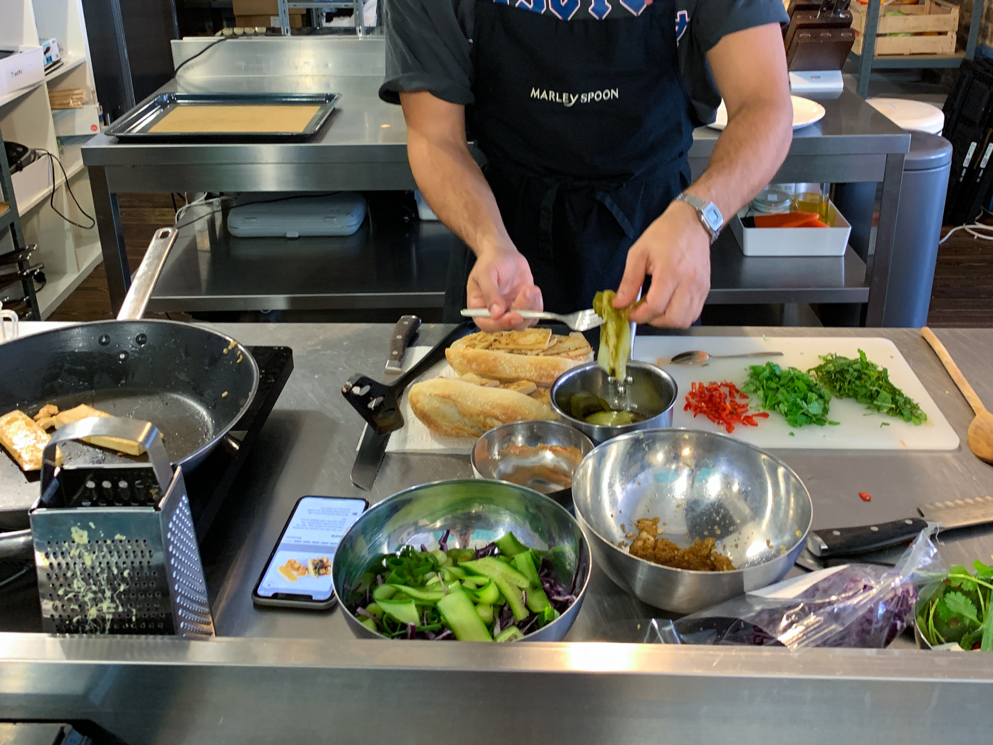
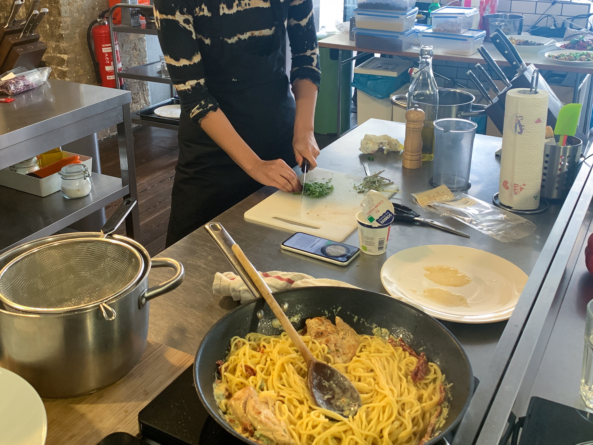
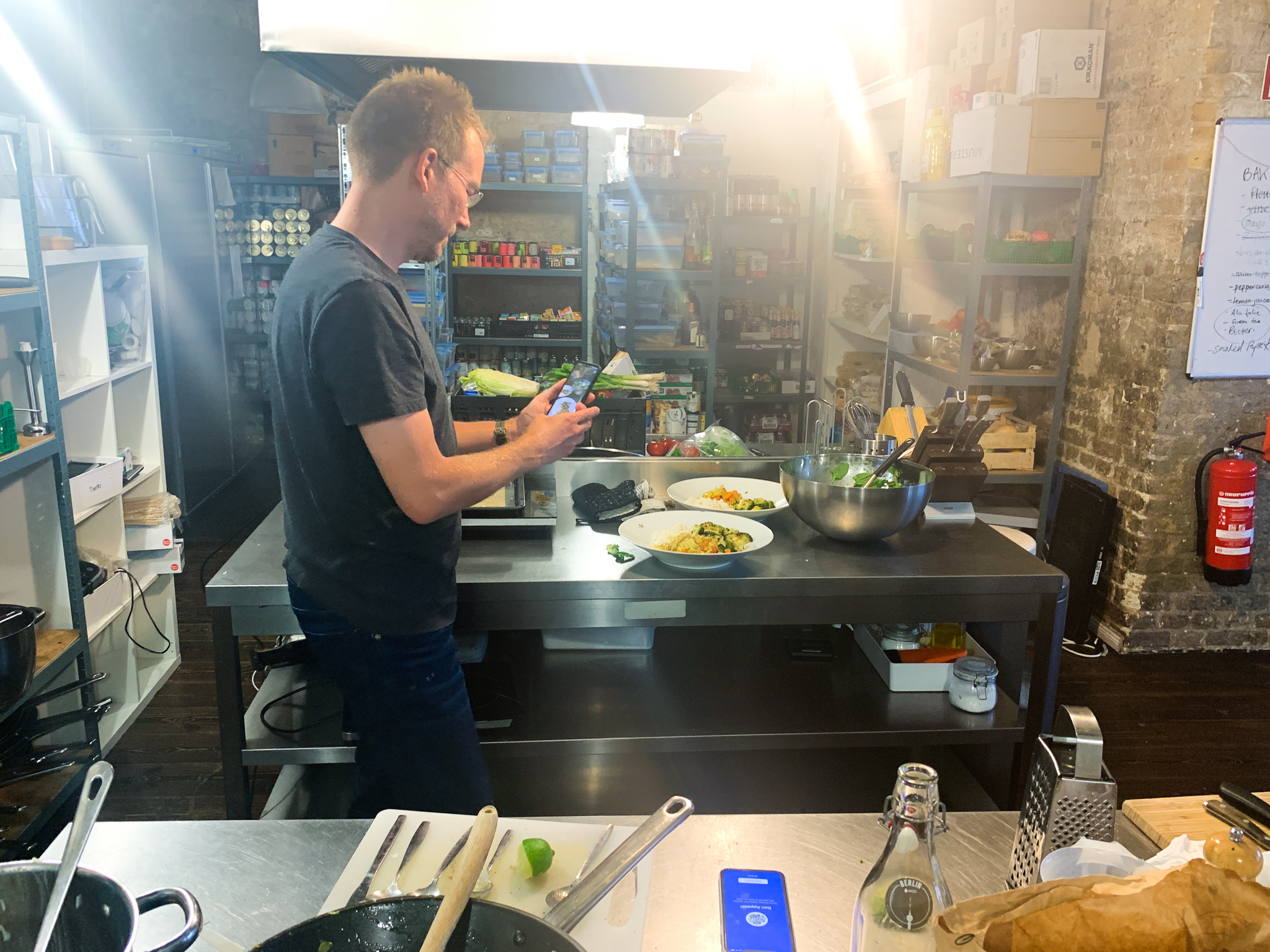
Bringing folks in to test our prototypes in our test kitchen was super rewarding. We learned so much about how people engage with their devices, surroundings, and approach using the recipes.
Delivery
As we approached the end of the initial design phase, we took stock of how we would shift into supporting the delivery phase.
We wanted to avoid a waterfall-style handoff from design to development, and to enable ongoing design iteration on a few key areas that we flagged for further exploration while development got underway.
Minimum Lovable Product design specs
As we converged on the Minimum Lovable Product in design, I conducted a user story mapping workshop based on our prototyping to visualize and plan development execution, as well as to adjust scope where required due to evolving capacity and business priorities.
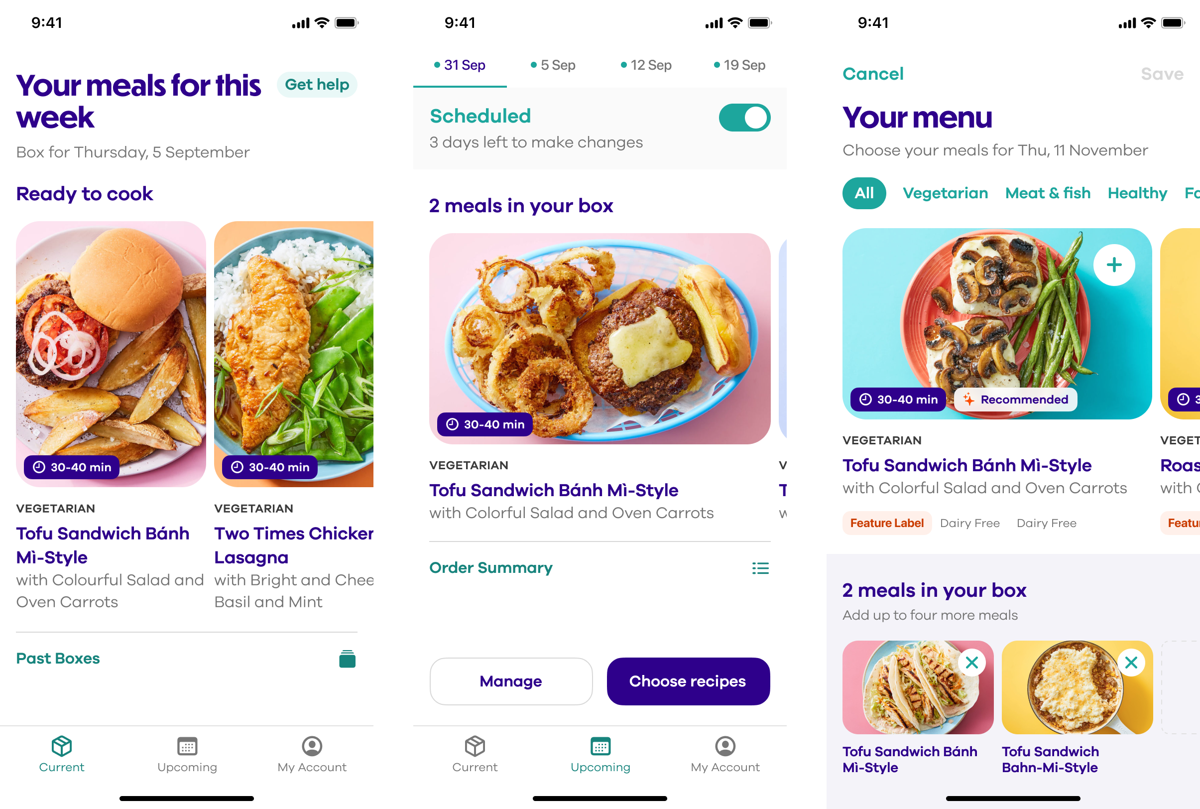
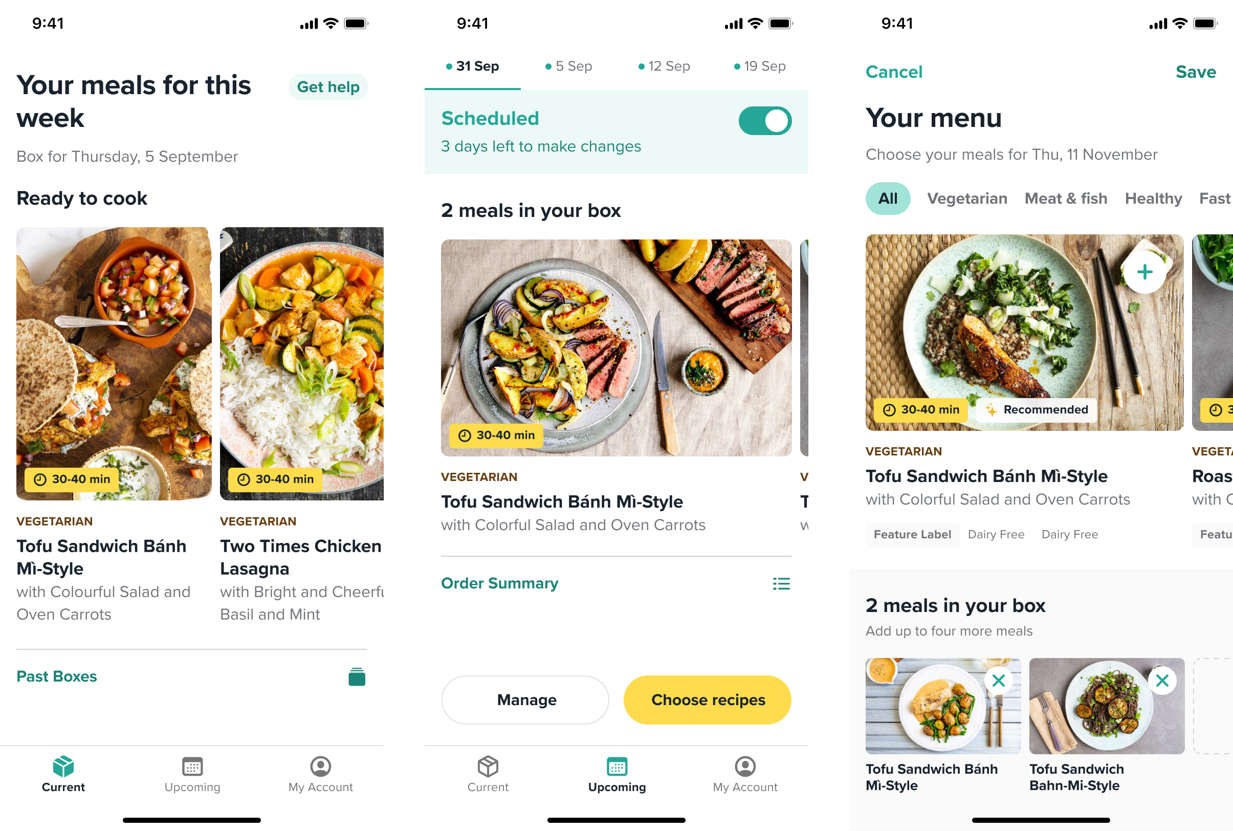
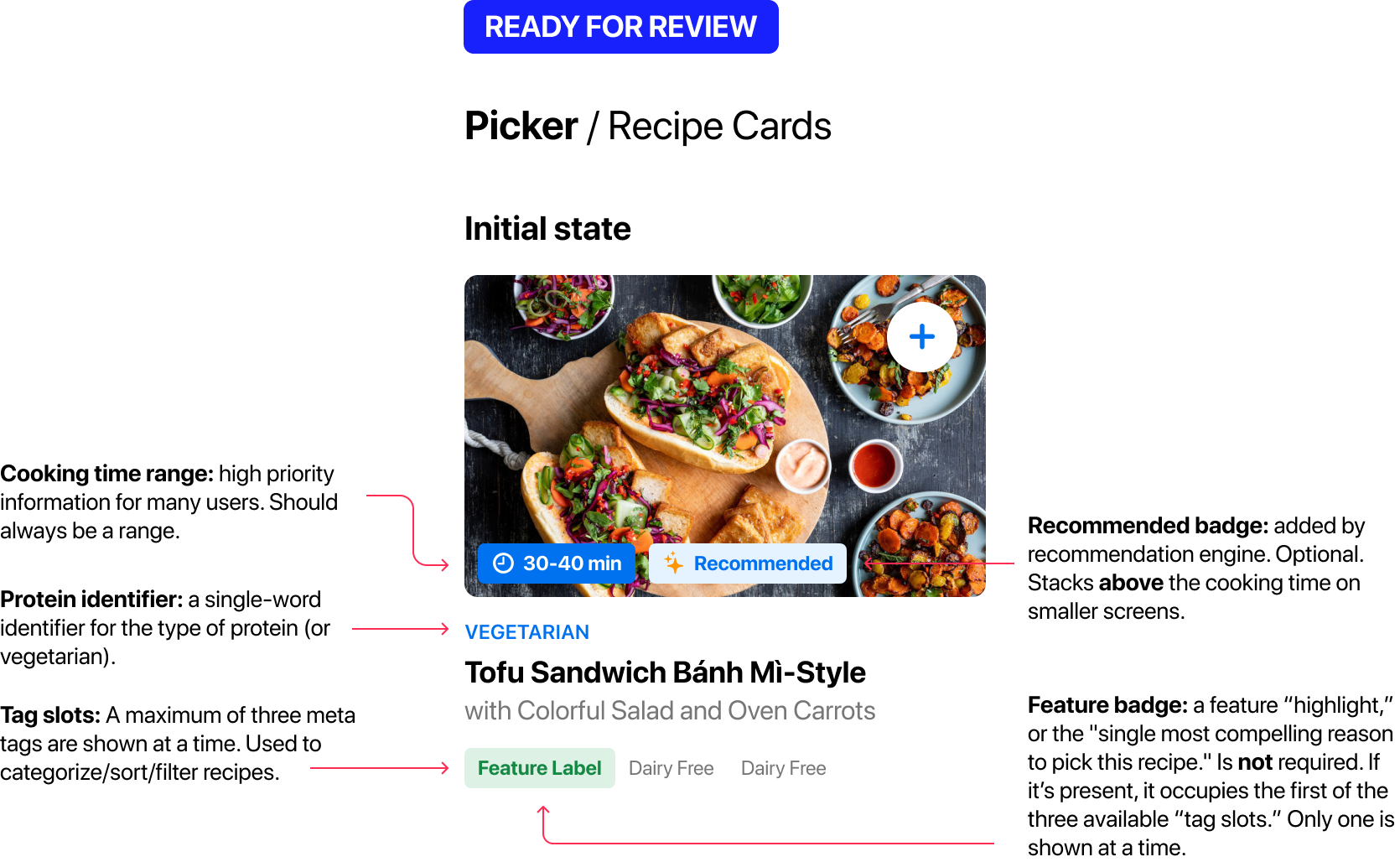
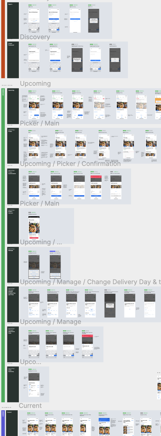
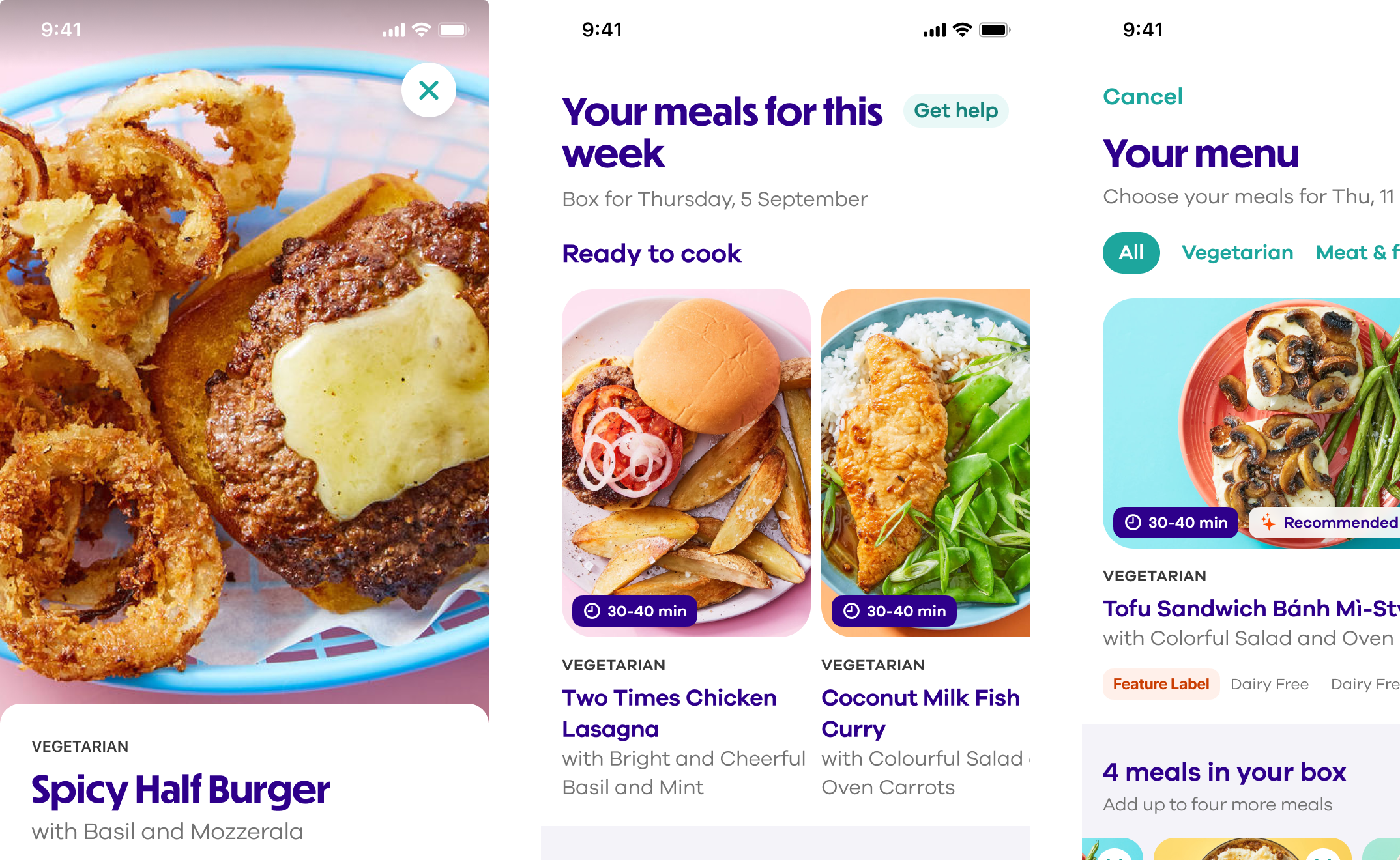
Then, the design team created a design spec file that captured all screens and states, along with detailed documentation around behaviour and functionality. This gave the entire project team a source of truth to reference alongside our Protopie prototype during development.
The result
The Dollop app shipped in 2020, and delivered a delightful, intuitive experience to tens of thousands of home cooks around the world across three different brands. It’s a key part of Marley Spoon’s long-term strategy and will support more than €130m in annual revenue.