Rebooting Sourcegraph’s search input
Organization
Sourcegraph
Role
Staff Product Designer
Date
2022 – 2023
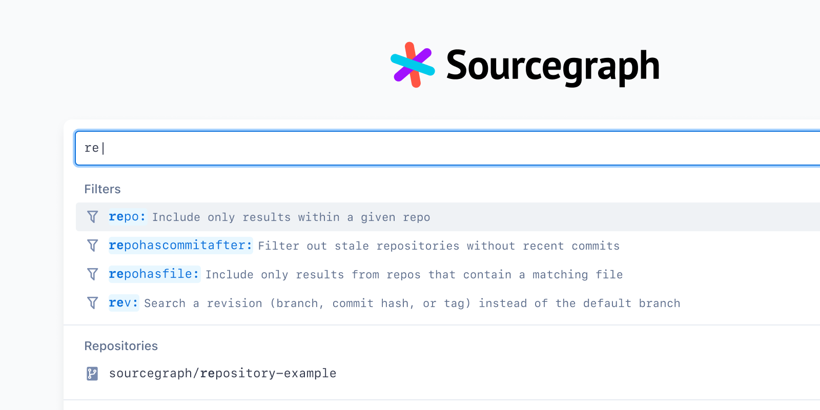
Sourcegraph is a universal code search and intelligence platform. Tens of thousands of developers in some of the largest companies around the world rely on Sourcegraph to search across and navigate all of their company’s code on all of their code hosts.
We achieved meaningful product market fit with Enterprise-scale customers: big companies with billions of lines of code often spread across many code hosts. In these companies, developers couldn’t expect to search across or navigate this volume of code in their local IDE. This is where Sourcegraph came in.
As a code search platform, Sourcegraph’s primary entry point for developers is the search input that appears on the search home and on every subsequent page.
Search queries in Sourcegraph are written using a filter:value language. Over time, the team added features like search mode toggles, autocomplete suggestions, syntax highlighting, and other things to make searches more powerful.
However, each new feature increased the actual and perceived complexity of Sourcegraph’s search. We learned from ongoing usability research, customer conversations, and sales/support folks that Sourcegraph had a very steep learning curve. It was easy to get things wrong, and difficult to troubleshoot or even recognize why.
Previous attempts to solve these problems hadn’t worked well, and sometimes made things worse—because they were spot solutions for specific problems, without regard for the overall search input experience.
Triggered by a combination of ongoing user research, a new product feature to surface search history, and an evolving competitive landscape, I partnered with a search engineer to explore, prototype, and propose a vision for a reimagined search input with a strong systematic interaction foundation, which was shipped in early 2023.
We established a set of core principles to act as constraints in design. Some of these included:
- At the most baseline level, the search input UI’s role is to take you to your destination—whether that’s code search results or reading and navigating code.
- If the search input’s role is to take you to your destination no matter where you are in Sourcegraph, then the search input UI must be omnipresent / always available.
- Search input is its own UI paradigm—it is not an IDE, is not a naked text input, is not a command palette. Do not try to replicate those paradigms, but do steal from them what we can to improve usability and intuitivity by leaning on existing knowledge.
- The search input should be a fully self-contained UI.
- We should design a system, not a view. Avoid rigid solutions, and lightly consider (but don’t solve) a future where we have things like natural language search, etc.
- The search input must progressively support both new and experienced users. For new users, it should be approachable and intuitive. For experienced users, it should support robust input and complex queries.
We came up with a range of search queries that might be run by users at different stages of their understanding of Sourcegraph and its query language.
Then, went deep into design exploration, focused on getting the underlying interaction pattern right. There were a lot of subtle things we had to get right, from keyboard navigation and accessibility, to surfacing information at the right level of detail at the right time, to just the general feel of the search in action.
The most promising direction was built around a command palette pattern, rather than a text field.
The specific types of content we landed on to explore include:
- Suggestions: Possible filters to add based on interpreting your input. Goal is to “Give you what you need to write your query successfully”.
Operates on current token (
ty→ suggeststype:) or the entire query (type:diff→ suggestsafter:before:andauthor:filters). - Completions: Possible values for a given filter based on interpreting your input. Goal is to “reduce what you have to type.” Only operates on the current token.
- Matches: Based on input (with heuristics), give you
${entities}that match your query in some way (e.g. repos, symbols, files). Goal is to enable code navigation. - Actions: Based on the query (with heuristics), take some action that involves that query (e.g. save search, create insight). Goal is to “Do something with this query.”
- Recent: Recent searches. Fuzzy matching based on whatever’s in the query right now.
Underlying structure
The rebooted search input is essentially a command palette pattern. When active, the search input field always has focus, and content within the container changes depending on a range of conditions. Suggestions, completions, matches, and recent searches all enable different behaviour (add to query, jump to the file|repo|symbol, run the search).

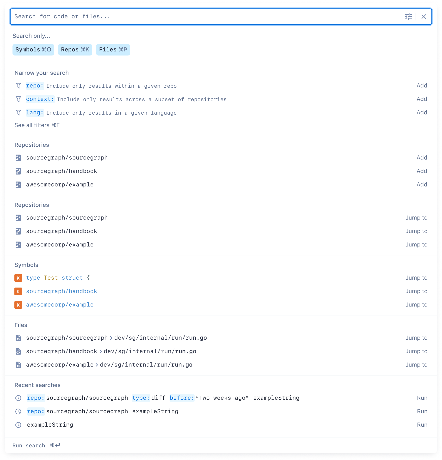

When a brand-new user triggers the search input with no content, they will typically see something like this:

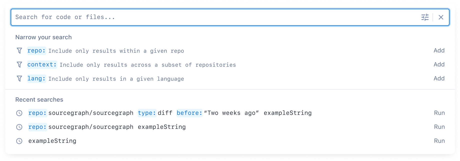
After they’ve run a few searches, they’ll then start seeing recent searches:
When the user starts typing a search, we use a variety of heuristics to give them the most meaningful content in that moment.
We learned that the first item in the list essentially always has to be selected (unless it’s an empty input). This makes it so that the search button isn’t necessary, which is critical for a command palette pattern. A common pattern we found in Slack, GitHub, etc. is that, although duplicative, the first item reflects the search content itself. We experimented with this as a starting point.
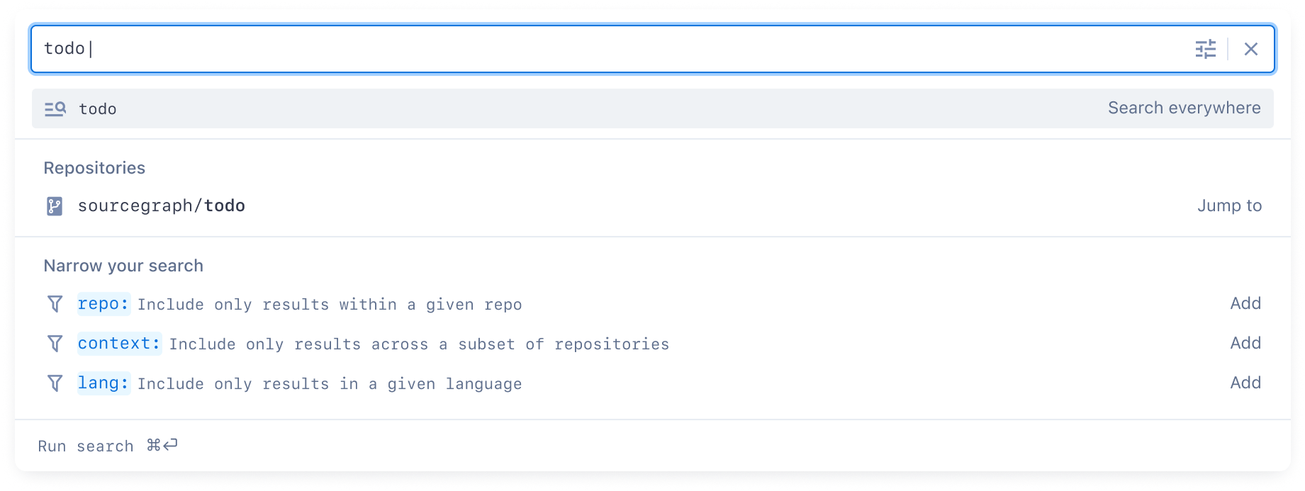
Note that when a completion is being shown, the first item is the completion, not the search. This makes it so that you don’t have to hit “down” to select the first completion suggestion.
Since rebooting the search input means we could be intentional about the whole search UI, found a couple of improvements to how the search query is formatted to improve usability, based on previous customer research and the difficulty of troubleshooting with the previous IDE-style autocomplete pattern. Essentially, we needed better affordances for the correctness of the query syntax, while making the search query input mirror the suggestions to improve user understanding of how it relates.
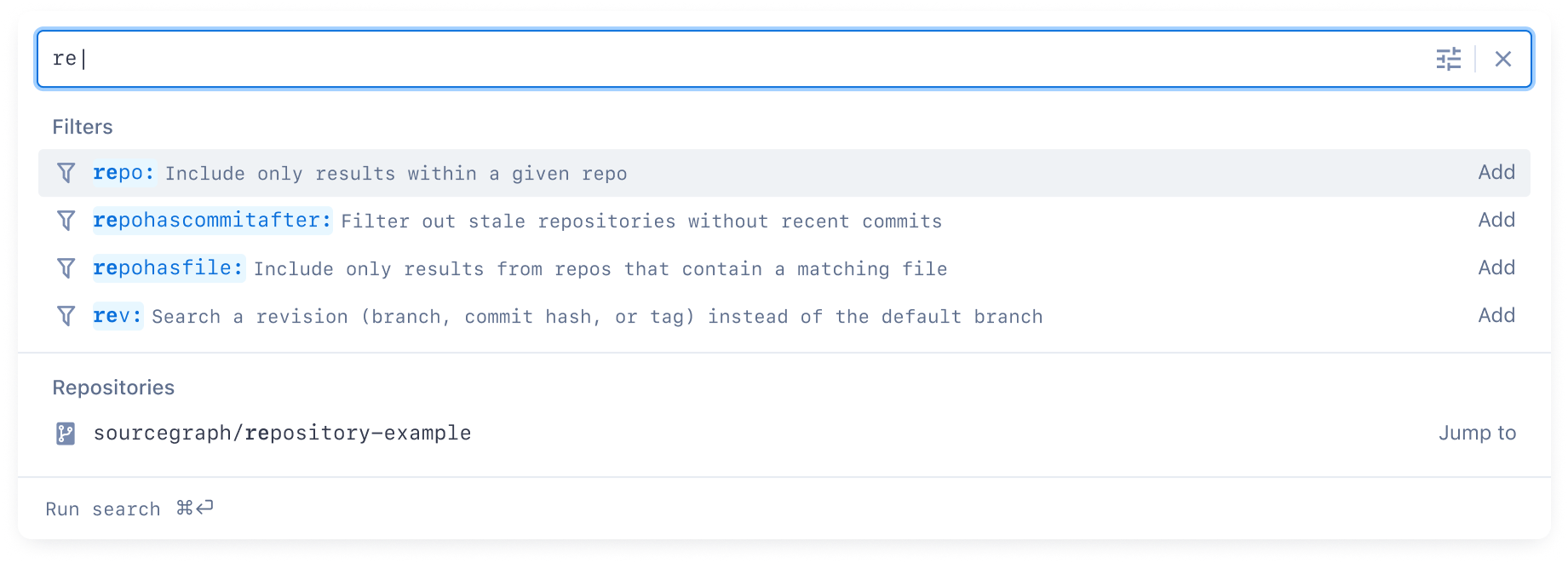
Here are a couple more search situations visualized and the resulting behaviour.
Suggestions for prefix-matched filters, and a matching repository:

Completions for languages:

Short-term followups
Search contexts
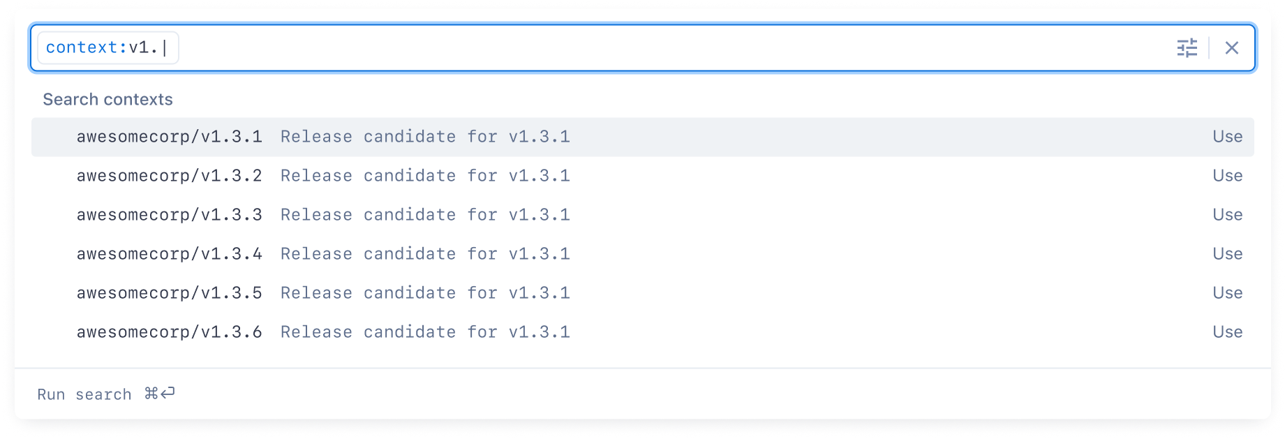
Some of our customers have a lot of repositories and search contexts are how they search across specifically the code they care about. The search input UI needed to seamlessly support both default search contexts and changing the context for a given search.
The command palette pattern suggested a solution where the context itself can be shown in the input, but treated as a token that can be removed or updated. This, together with removing the “global” context, seemed to work well in the command palette pattern.
For example, a new security team member at a large customer might be assigned a default context called security-team. Every search they do would include this context as a token.
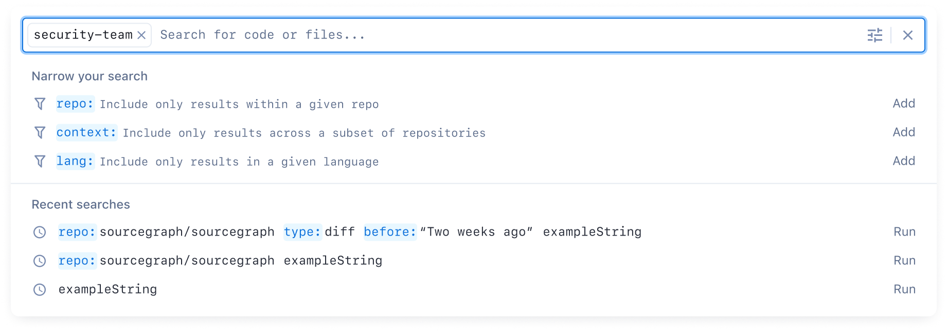
When conducting a simple search, we convey where they’re searching across. To keep the search input pretty minimal, we consolidate the context down to just the name.
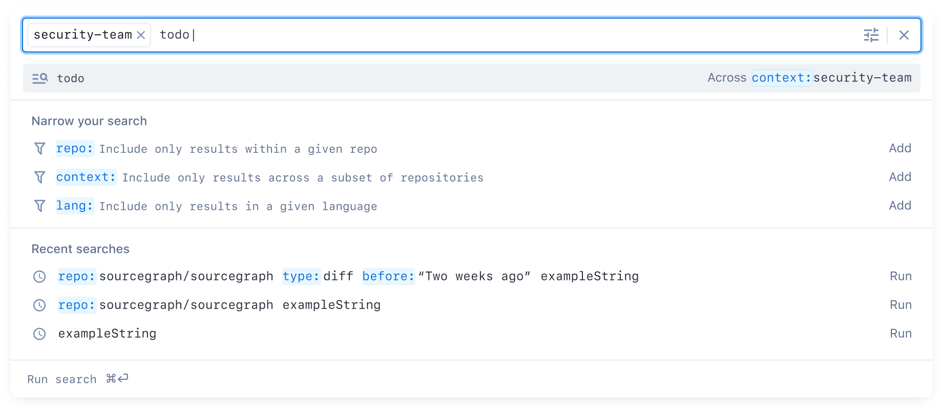
Search contexts can be presented as a type of completion, same as any other content type. Clicking the token triggers showing these completions, as a bit of a special case of UI behaviour. Typing context: triggers the completions and the token formatting.
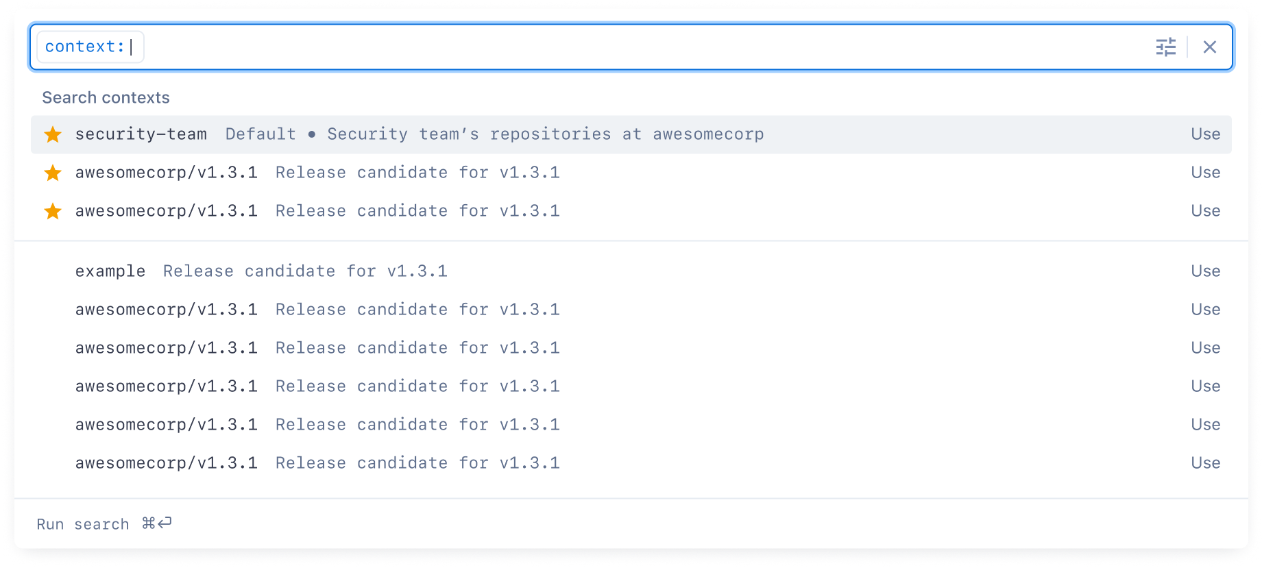
Since contexts are ultimately a completion content type, like any other, it can filter in real-time, removing any need for a separate text input or popover for contexts.
Typed searches
The command palette pattern introduces the ability to have a “paged” content navigation pattern internally.
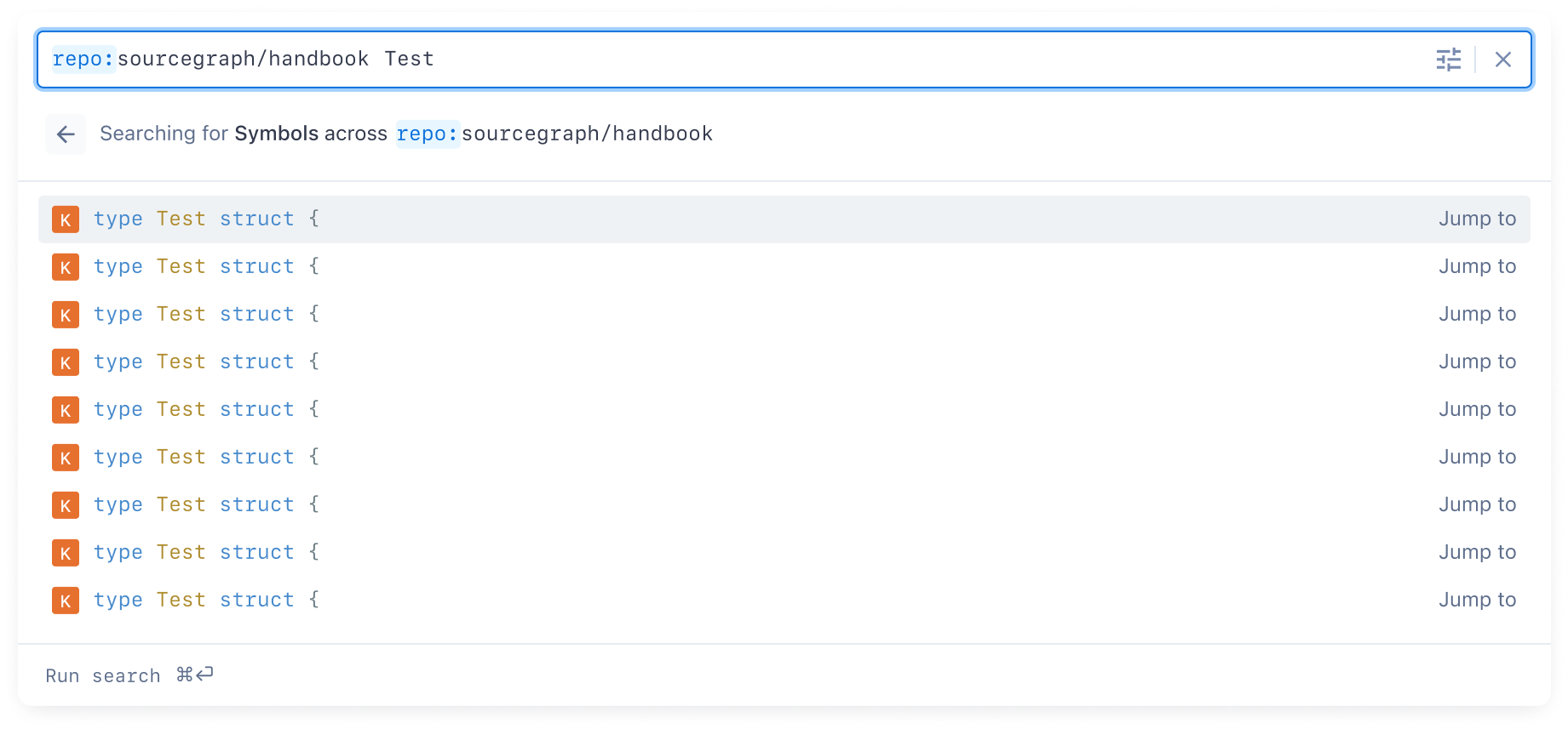
Some actions/commands can trigger this kind of content, such as typed searches for repos, files, and symbols.

Here, a user can trigger the search input with a global keyboard shortcut (/), and then click on (or use the keyboard shortcut for) either symbols, repos, or files.
These elements are only shown on an empty search input. Switching to one changes the content to include only matches for the given type.
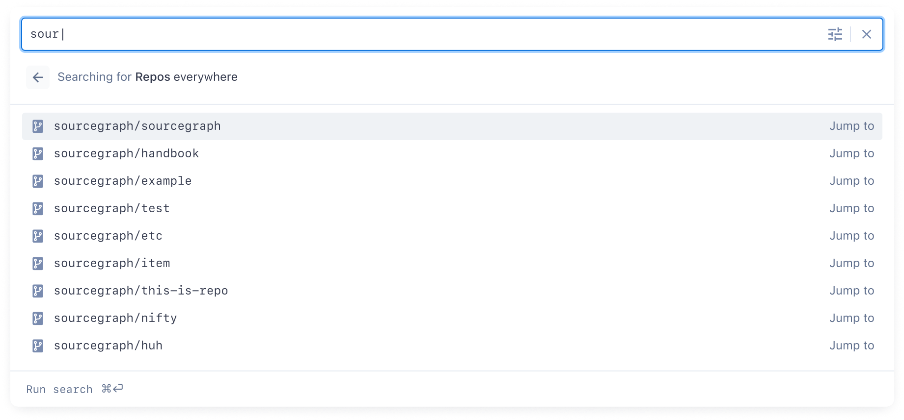
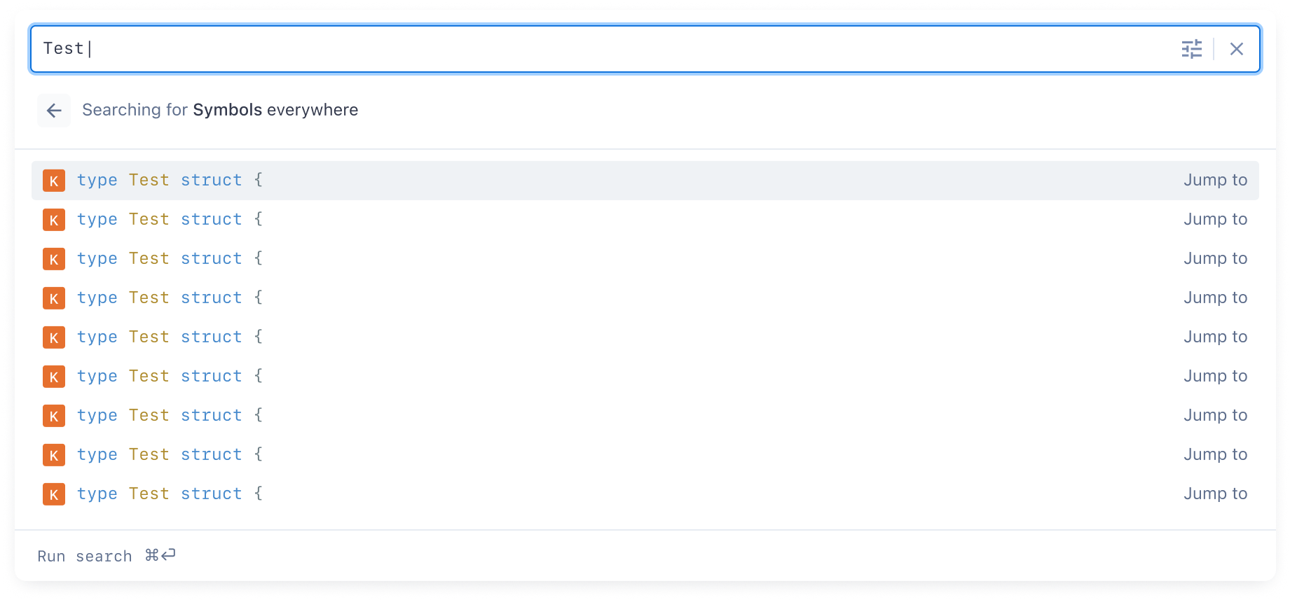
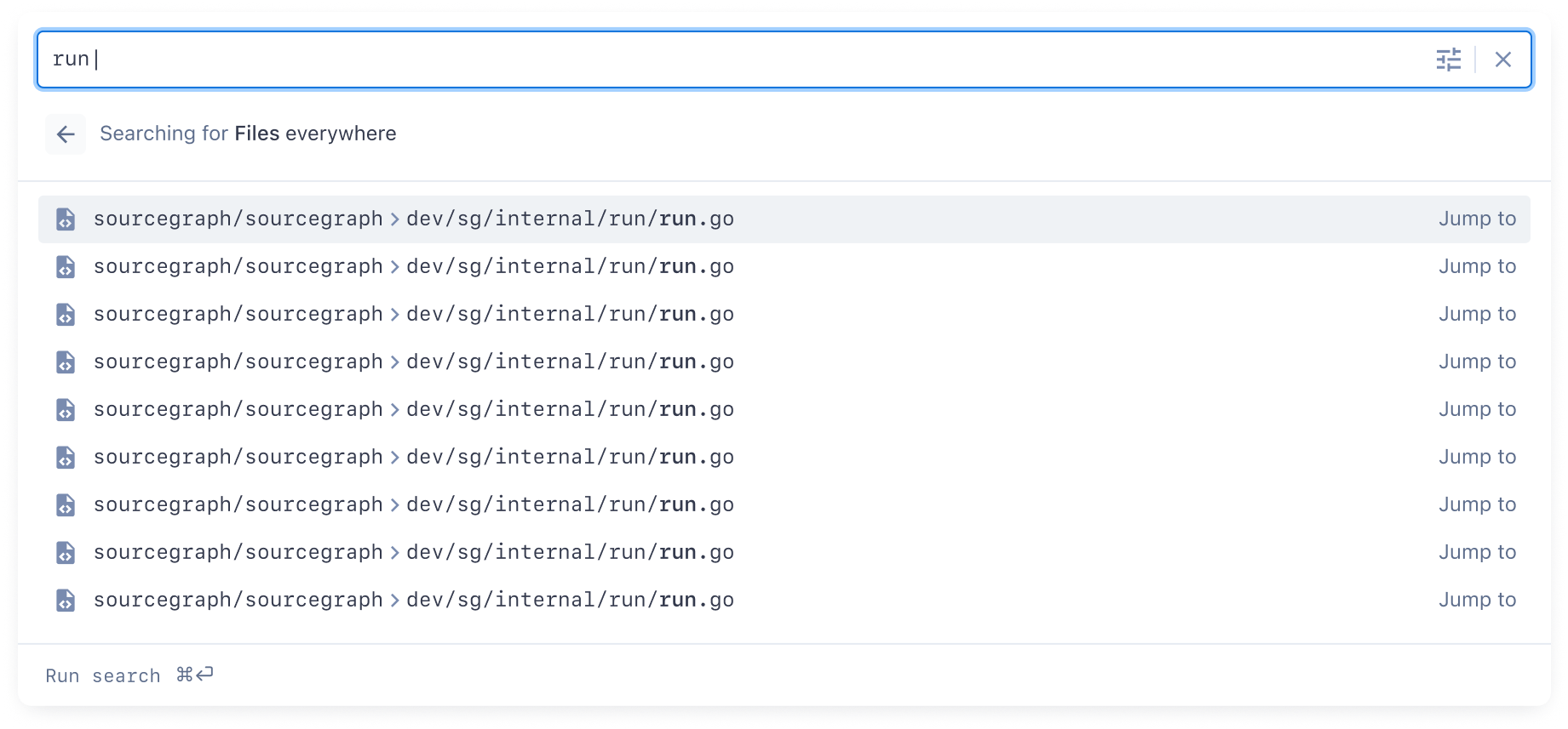
In this paged navigation pattern, the user can hit esc to go “back” a level and return to a “normal” search.
What was particularly compelling about this approach is the user could use the shortcuts for one of these searches globally—in other words, a user could trigger a file search from a repo view with a single command—and we could then use the user’s location as a cue for the search. Consider the user triggering a symbol search with a single command from within the handbook repo:
Longer-term opportunities and proving the underlying system design
An actual command palette
What was really cool about this approach to the search input is that it’s effectively a purpose-built command palette—meaning it can support commands!
Actions can be included directly in the search UI as a content type. For example:

Slash-based commands in the search input itself are also straightforward. For example:
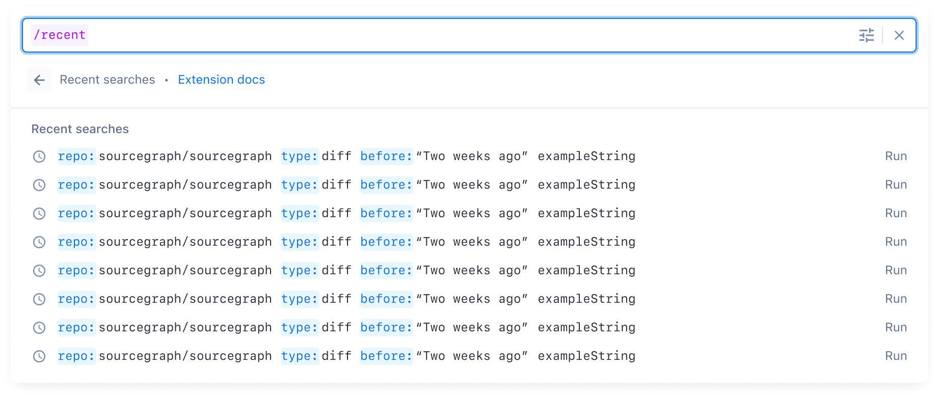
This underlying system for the search input means that the search input can be itself extensible. Imagine if any customer could build their own extensions with custom commands for their use cases, related to their code!
A command palette... in the IDE
Since this rebooted search input was fully “self-contained,” it’s possible one day it could be brought directly to IDEs or local systems. Users could use Sourcegraph wherever they are, with the exact same functionality in their IDE as in the browser, without having to “recreate” the full Sourcegraph UI as we were doing at the time.
This rebooted search input shipped in early 2023.