Crafting a unifying design system for Ducks Unlimited Canada’s online ecosystem
Organization
Ducks Unlimited Canada
Role
Project Lead, UX Designer, UI Designer, Front-end Developer
Date
2015 – 2018
Ducks Unlimited Canada (DUC), a nonprofit environmental conservation organization, conserves wetlands and other natural spaces for waterfowl, wildlife, and people. For more than eighty years, the organization has been protecting and managing habitats across Canada that affect the lives of millions of Canadians every day.
In late 2015, I lead a project to define and implement a new supporter engagement strategy for DUC’s digital ecosystem (read the case study).
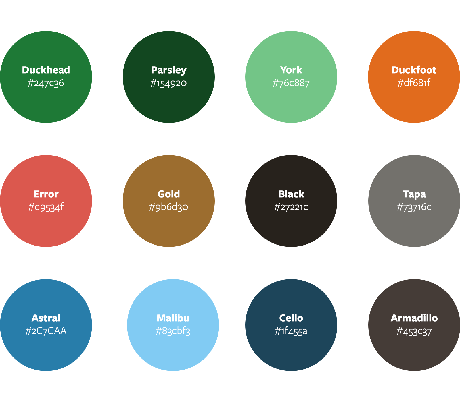
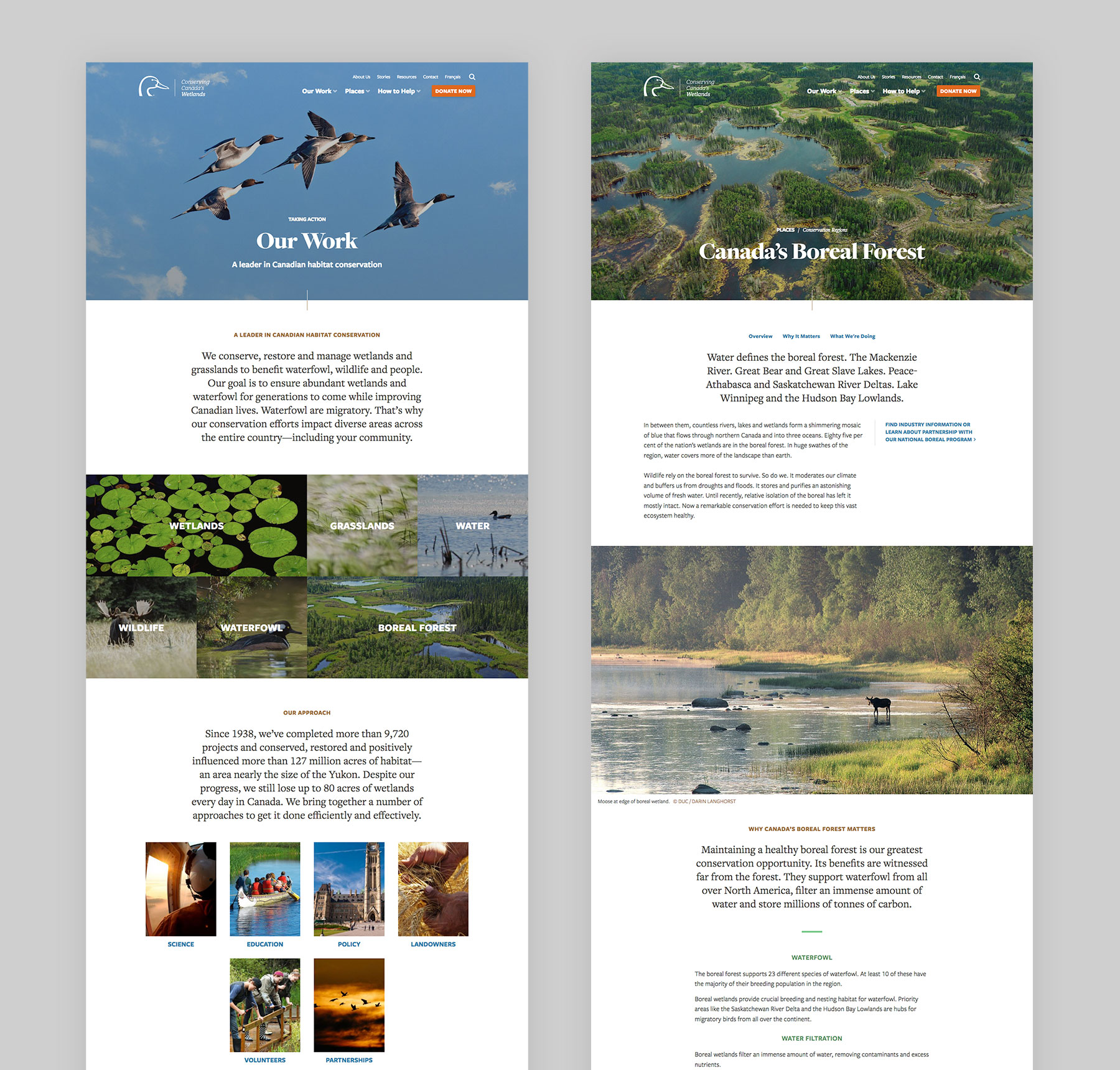
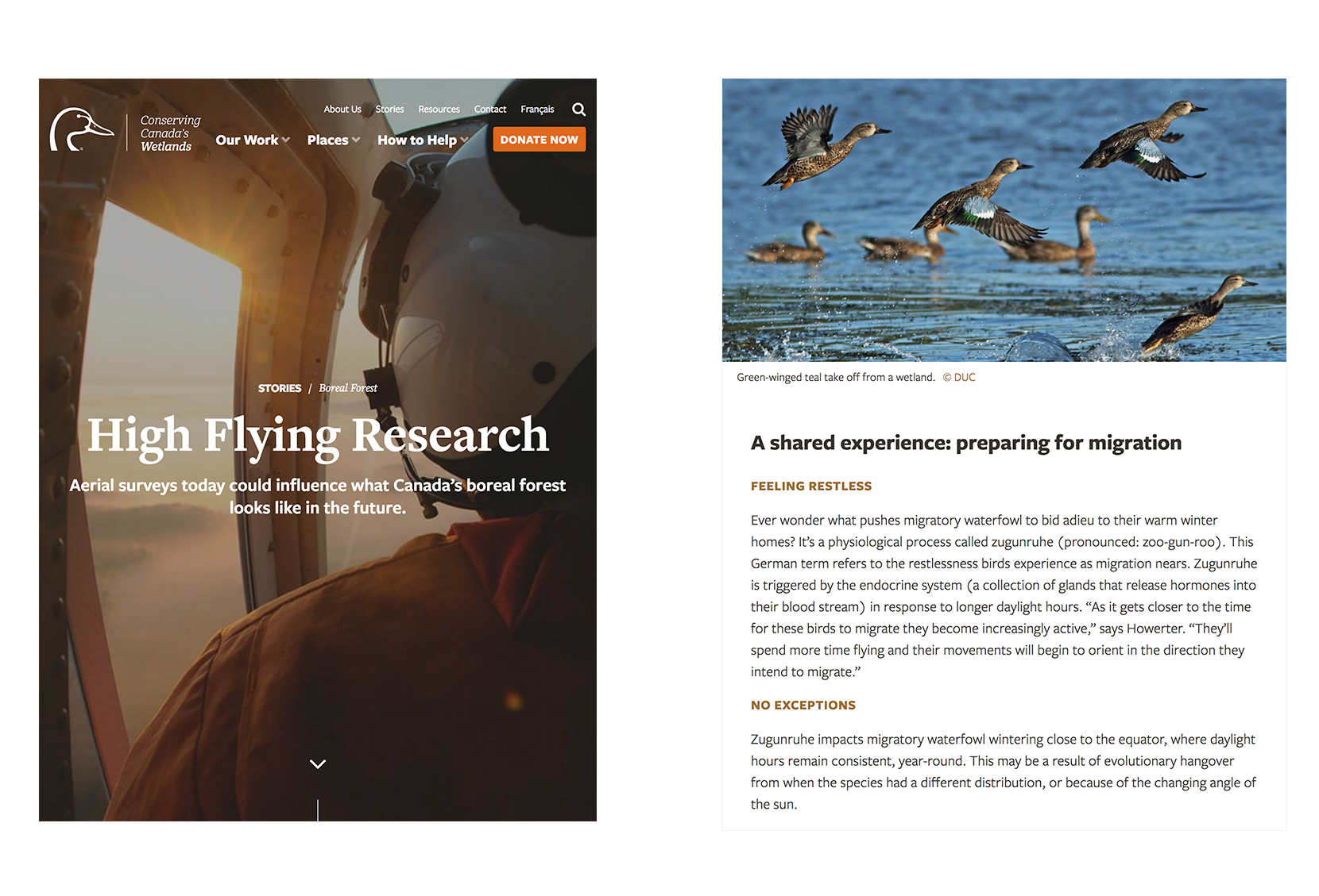
Based on this strategy, we needed to create a new UI design system that would unify DUC’s digital platforms through a common design language. This new design system would be put into action as we renewed DUC’s public outreach website based on user and business insights.
Challenges
As the project kicked off, we identified our key challenges, which we captured as “How Might We” statements:
- How might we provide clarity and purpose for the content on DUC’s public engagement website?
- How might we craft a sustainable, accessible, and unifying user interface design system that would meet immediate and long-term needs?
- How might we make it easy for non-technical editors to visualize and craft their stories and content?
Strategy
Content Strategy Statement
We needed clarity: a statement of purpose for the website and its content. In response, I crafted a content strategy statement by which content would be created and evaluated.
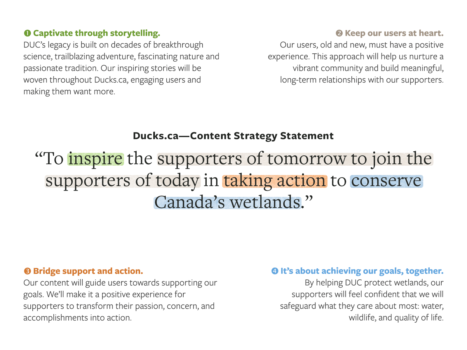
Based on this content strategy, we identified and cut irrelevant, outdated, and poorly written content to reduce the total number of pages more than 70%, and started a rewrite or refresh of all remaining content.
Information Architecture Diagramming
Based on user research during the supporter engagement strategy project, we knew our priorities were to help users:
- Understand what Ducks Unlimited Canada does, and why its work matters.
- Understand what Ducks Unlimited Canada is doing in their area.
- Help to make a meaningful difference in the issues that concern them most.
- We defined the content hierarchy based on these specific needs.
We knew that to we needed to create emotional resonance with our users. To do this, we needed to lean on the human stories behind our work. We needed to share what was happening on the ground, and highlight the people, the projects, and DUC’s impact on water, wildlife, and wetlands.
Prototyping & Design
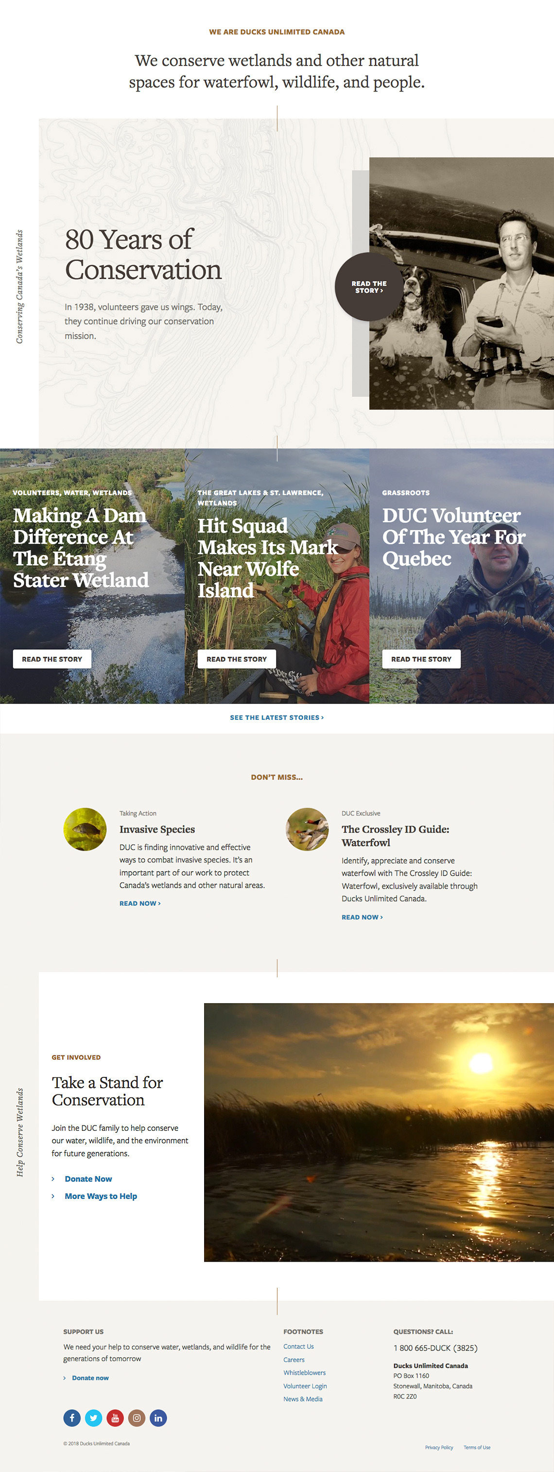
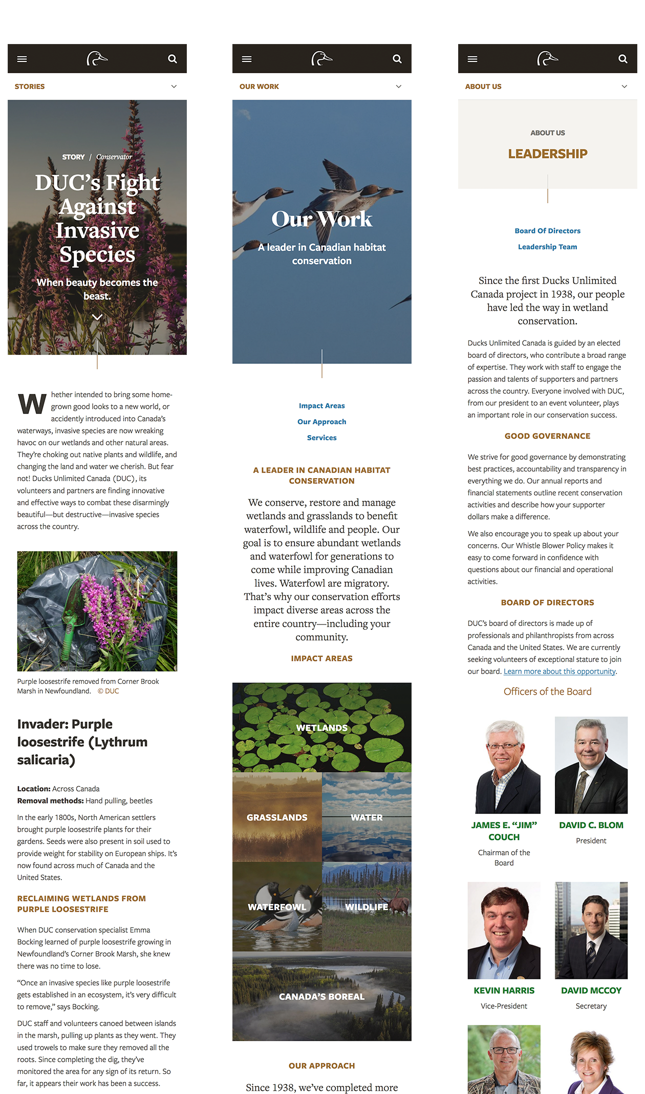
I started a process of iterative wireframing and prototyping using Adobe Xd. To meet the challenge of making it easy for non-technical content editors to visualize and edit content, I explored a series of block-based components that could be stacked, mixed, and matched to suit the needs of the content.
After review, I moved into designing the UI and design system.
High fidelity design
Results
Sustainable, living UI design system
- Living design system: ongoing iteration and refinement to meet evolving user and business needs.
- While initially created in Adobe Xd, the design system was migrated to Figma for ease of collaboration and a more robust UI component library.
- Enabled faster prototyping of new ideas.
- Implementation makes it easy for content editors to visualize and create content.
Greater user engagement
+116%
average views per page
70%
reduction in static content
1.5s
average page load time
The relaunched Ducks Unlimited Canada website is driving greater user engagement through longer sessions, more pages per visit, and more conversions via supporting actions.